Tag Archives: VS

Maybelline Master Sculpt Contour Kit VS. Collection Highlight and Sculpt Contour Kit

Good Evening Munchkins!

Today I will be comparing two of my most beloved contour kits for you, both of which are drugstore and very reliable. I have written a full review on the Maybelline Master Sculpt Contour Kit (see HERE) but I don’t think I’ve actually mentioned the Collection Highlight and Sculpt Contour  Kit on this blog before (whilst editing this I realised I was wrong – HERE’S the review of it!). Spoilers: I do love both of these but I just thought that I would tell you the properties of each one so you know straight away which one’s for you or you’re most likely to use! Anyway, on with the blog post!

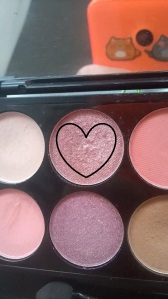
(L-R) Collection Highlight and Sculpt, Maybelline Master Sculpt

Just as a little disclaimer, this has been tested on very white skin! I think I mentioned it before, but I have found the Maybelline kit slightly orange if used too heavy-handed-ly and when not blended out properly. However, since then I have started using it with a much lighter hand and it can create a really nice, neutral contour that doesn’t look too much like an orange line down the side of my face. The Collection one is a much darker, warmer brown – something we would traditionally expect from a contour shade. I can still make this work on my pale skin but when I’ve used both on my face, there is a major difference and, again, you have to be very light-handed with this.

Both of these contour kits are so, so pigmented. But if we’re also going to bring longevity into the mix, I think the Collection kit actually wins on that front. I think because Collection is a cheaper brand this would surprise quite a lot of people, including myself. When first applied, Maybelline does appear really pigmented and, as I said, you can’t be heavy-handed with it, but over time it does wear a lot more noticeably. Considering all these points, I would say that Collection is the more pigmented product.

17274865_984757344994828_1284686427_n
Maybelline Master Sculpt Swatches (R-L) Contour, Highlight

Onto ease. I think anything is easy if you just know how (obviously!) but the Maybelline is much easier to wipe away or blend out. If you have gone a bit heavy with the Collection kit, you need to top up on foundation, use setting powder – pretty much your entire face routine again just to lighten it slightly. Both are very easy to apply and blend out, just be aware of how much you put on and how difficult it is to remove – you can always add more but it’s way harder to take just a little bit off again!

I realise I haven’t actually spoken about the highlighters, which is a crime in my book! I know this has nothing to do with the blog post, but I realised yesterday that the way I react to highlighters is the same way my Mum reacts to puppies! Anyway, moving on – both of these highlighters are of a similar quality to their matching contour shades; the Maybelline one isn’t as ‘out-there’ and wears really easily whereas the Collection one is a bit more noticeable. In terms of colours, the Maybelline highlight shade is quite vanilla-y whilst the Collection one is slightly more peachy-toned/tanned, but still entirely wearable. They’re both shimmer highlights but they’re not overly glittery (though the Collection one is still more pigmented and high-profile than the Maybelline one). As long-term readers will know, I am a sucker for highlighter so obviously this is important to me and I do think the Collection one can look a little too dark for me whilst I’m this shade of pale! I will still wear it but I am very aware of that factor.

17270510_984757321661497_1089552105_n
Collection Highlight and Sculpt Swatches (R-L) Contour, Highlight

Something else I’ve noticed about contour kits is whether I would choose it for daytime (i.e. shopping or school) or nighttime (i.e. parties or a meal out). I would definitely use the Maybelline one for daytime because I can create a natural contour with it and highlight my cheekbones slightly but not too dramatically. As you can tell, I do do this and will use it on the daily! The Collection one I will use for daytime if I’m out all day or want an extreme contour/highlight, but it is the one I lean towards for nighttime due to it being so much more dramatic. Another thing I like to do, though, is mix the two; I will apply the Collection one and blend it out slightly with the Maybelline one so I look bronze-y as well as contoured.

Finally, which would I recommend? This really does depend on your needs and wants in a contour kit and whether you want an extreme, Kardashian look or a daytime ‘I do have cheekbones, here they are!’ kind of look. I think it’s quite obvious which is which, but they are both so affordable and so accessible that I think if you buy one and decide you don’t like it, it’s not money down the drain entirely. Both kits are also amazing to use on the eyes for an easy daytime look! I also think that it depends on your confidence and ability with makeup and contouring – if you’re more of a beginner I would head towards the Maybelline one just because it is easier to use. The Maybelline Master Sculpt Contour Kit is available from Boots and Superdrug for £6.99, and the Collection Highlight and Sculpt Contour Kit is also available from Boots and Superdrug for £4.19.

And there we have it! I hope you have enjoyed this blog post – I love comparing different products for you so let me know what other products you would like to see in another VS.! If you have used either of these products, let me know what you think of them, or if I’ve convinced you to try one or the other!

Thank you so much for reading and I’ll see you Thursday,

Rachel xx

Morphe VS. Makeup Revolution [Eye Shadow Palettes]

Good Afternoon Munchkins!

Today I will be chatting you through my findings whilst using the Morphe 35K palette and the Makeup Revolution Flawless Ultra Mattes palette, and the differences I’ve found between them. As a little bit of background, the Morphe palette contains (as you may be able to tell!) 35 eye shadows, which are mainly neutral, and contain a mixture of matte and shimmer shades. The Makeup Revolution palette, however, contains 32 entirely matte eye shadows in much smaller pans. This won’t be a full review on either palette (though if you would like that, please let me know and I can write that for you), it will just be ‘VS.’ between the two of them and pointing out their obvious differences.

So the first thing I’m going to be talking to you about is the pan sizes. I know to most this won’t seem like anything that interesting, but the difference is significant! In the Makeup Revolution palette, the pans are much smaller, meaning you do get less bang for your buck (I hate that phrase, but it fits!), but there are so many colours to choose from, I don’t think you’ll be missing out too much! I’ve had this for nearly a year and use it quite a lot for school and I haven’t hit pan yet, so it does last for a while. In the Morphe palette, my brushes literally swim in the pans! They are massive and I don’t know how I’m ever going to finish one eye shadow let alone the palette! I’ve only had this since Christmas so I wouldn’t expect to hit pan on it no matter what palette it was, but this is definitely going to last me a lot longer. At the same time, though, I think you do pay for the pan sizes you are given with both palettes.

16831592_971843359619560_1715125123_n

As I’ve already mentioned, the Makeup Revolution palette I own contains only mattes (though they do offer other palettes with shimmer shades) and the Morphe one contains a pretty even mixture of mattes and shimmers. The Makeup Revolution palette is quite pigmented and can last throughout a day where you’re not doing much, but the Morphe colours can literally go through natural disasters and a world war and still look just how you applied it earlier that day! They both contain relatively neutral shades (i.e. creams, browns, blacks) with the odd exception of a few pinks or blues along the way. Although the Morphe shades win on the pigment and longevity front, the Makeup Revolution palette does come with a sheet of clear plastic which has the eye shadows names on, something I really do appreciate when I’m writing blog posts. This does depend on your wants and needs in a palette, but I find that when the eye shadows are labelled, they’re much more practical when blogging.

Onto the packaging. As you can see, both are in a very minimalist black, plastic casing. The Makeup Revolution has a much glossier effect whilst the Morphe one has a matte, wipe-down finish (the irony), both of which are easy to travel with and I can wipe any spillages off of. Both also have the names of the brands imprinted on the front; the Makeup Revolution one in a gold, which has started to chip away slightly, and the Morphe one containing it’s usual white and red logo. They’re both click shut and, despite being smaller, I actually think the Makeup Revolution palette is relatively heavier than the Morphe palette. Also, it’s quite evident the size difference of both palettes – the Makeup Revolution palette is less than half the size of the Morphe one, making it much easier to travel with. In saying this, you could get away with only taking one of these palettes with you if you were to travel because they contain practically every colour you could ever need, particularly the Morphe palette. Something else which is quite stand out is that the Makeup Revolution palette comes with a mirror whilst the Morphe one doesn’t. This isn’t great for practical reasons, but I do have loads of handheld mirrors I could use in replacement of Morphe’s lack of mirror. Neither of these palettes come with a brush.

Finally, price and availability. The Makeup Revolution palette is available from Superdrug for £8. I personally find this a really reasonable price for a palette of so many colours which are of a decent quality, particularly for beginners. It’s also really easy to get hold of because it’s available in-store and online. The Morphe palette, in the UK, is only available online at Beauty Bay as of recently and retails for £21. This is much higher in price but you do get what you pay for and if you divide that price by the amount of eye shadows, it’s still less than £1 per eye shadow.

I love both of these palettes, though, and I think it would depend on the occasion as to which palette I would opt for. I think the Makeup Revolution palette is suited more to beginners or those who don’t wear makeup very often so just want one palette with everything in, whilst the Morphe palette is for collector’s or those who wear makeup more often (like myself).

And there we have it! I hope you have enjoyed this blog post – I love writing ‘VS.’ blog posts so let me know what else you would like to see compared! Also, don’t forget to let me know which palette you prefer out of the two if you own one, the other, or both for yourself! Or, you can tell me which palette I have now swayed you towards if you own neither of them!

Thank you so much for reading and I’ll see you Tuesday,

Rachel xx

Maybelline’s Pink Gold VS. Sleek’s Organza Eye Shadow

Good Evening Munchkins!

Today I will be comparing two drugstore eye shadows for you, one from Maybelline and another from a Sleek palette. These two are so similar and I have found myself sometimes not knowing which one to go for when I was creating a specific look so I thought today I would write a little blog post to weigh up the pro’s and con’s of both and see if I can finally decide! I think this will be more suited to absolute makeup geeks like myself or makeup artists because it is going to be quite in-depth about colour and formula, but, of course, everyone is welcome to read this blog post, it’s just a little heads up! I have written individual reviews on these so it will just be comparing them, not explaining a thousand things about each one, as well.

Colour

16521625_961876190616277_199012551_n
Left: Pink Gold Right: Organza

As I’m sure you are all aware by now, these colours are both shimmery pale pinks which can be worn on their own or in combination with other colours. However, when swatching I did notice some differences. For example, Organza is much more peachy toned whereas Pink Gold is a truer pink shade. I genuinely didn’t notice this before but it looks really obvious when they’re side by side! This could effect what other colours you pair it with and what they compliment, and I do think that Pink Gold is much more suitable to a dark, pink smokey eye because of it and Organza can be used for daytime only, though you can wear it however you want.

Formula

16468925_961875950616301_862628236_n
Organza

As I’m sure you are aware, Pink Gold is a Maybelline Colour Tattoo so is a cream/gel formula which I prefer to apply with my finger. Unlike other cream eye shadows, this doesn’t crease at all and is super pigmented. However, Organza is a powder consistency with relatively big chunks of glitter in, which I personally don’t mind. I’m a ‘more the merrier’ kind of person when it comes to glitter! This, therefore, doesn’t crease either but I find it applies with much more pigmentation when I use my finger to do so. Also, just keep in mind that I use primer under powder eye shadows but not under cream eye shadows, particularly as this one promises to be a ’24hr’ lasting one.

Wear

As I think we all expect from the Maybelline Colour Tattoo’s, this does last all day/night with very little applied. This doesn’t wear off or lose any colour throughout this time, either, and the glitter also remains really well. I think it also works quite well with the gel eyeliner I use over it. On the other hand, Organza wears much more noticeably and very little remains at the end of a school day. I think it lasts a lot longer if you’re taking it quite chilled and not doing much, but when you’re rushing about it wears off quite easily. Some glitter is still evident but not much and some of my eyeliner can also come off with it. Basically, Pink Gold maintains much more colour than Organza and is much more heavy duty.

Price and Accessibility

16507062_961876053949624_1818446302_n
Pink Gold

As I mentioned at the beginning, these are both drugstore products but are on, what I consider, ‘different scales of drugstore’. This basically means I consider Maybelline to be of a higher brand quality than others, like Sleek. Sleek is kind of middle-high but Maybelline does top it slightly. This is also shown in the prices. One pot of Pink Gold is £4.99, which is relatively okay and I wouldn’t consider extortionate. However, the palette that Organza is in is £8.99, which means (technically) the eye shadow on it’s own costs around £0.75 each and is really good quality for money. Although this would now seem like the obvious choice, you do need to buy the whole palette for this one eye shadow I have just mentioned. It is a stunning palette and all the colours are beautifully pigmented but is it worth it if you want this one colour? Probably not and if you just want a shimmery, pale pink, everyday eye shadow, I would be more likely recommend to you Pink Gold. It is your choice though after everything you’ve read in this blog post. Pink Gold is available from Boots and Superdrug and Organza is also available from Boots and Superdrug (in the Sleek i-Divine palette in Oh So Special).

And there we have it! I hope you have enjoyed this blog post – I love comparing two similar products for you to see which is best so let me know what others you would like to see! Don’t forget to let me know which product you prefer if you own either/both of them or which one you have now been convinced to go for!

Thank you so much for reading and I’ll see you soon,

Rachel xx

Urban Decay VS. Maybelline: Easy Everyday Eye Makeup Look

Good Evening Munchkins!

Today I thought I would write another VS. blog post for you – I feel like I haven’t written one in ages! However, I thought I would write it slightly different to my other ones and instead of comparing two products, I thought I would compare the same makeup look but with different eye shadows. This is also similar to a dupe blog post (which I haven’t written one of yet – let me know if you would like that) because I’m comparing a high-end brand and a drugstore brand but I’m going to make my own conclusion on which one I prefer and I encourage you guys too, as well. Just a little disclaimer, I don’t know if my Naked palette (Urban Decay) is real or not but this is going by the version I own so sorry if it’s slightly different to yours.

The first thing I’m going to do is briefly explain what I applied where (thought it’s pretty much the same for each one!). For the Maybelline eye, I took the Master Sculpt compact and applied the highlight shade all over my lid and then took the contour shade into my crease. Using the same brushes (so there’s absolutely no difference whatsoever) I took the shade Half Baked from the Naked palette and applied this all over my lid then pressed Buck into my crease. In each pan, the shades do look slightly different but they’re still really similar (or at least enough so to be a dupe of each other). I also used a primer for both of these looks so they look as similar as possible.

In this blog post, I’m just going to be comparing the products themselves as oppose to every minor detail – if you would prefer that, just let me know and I’ll bare that in mind for next time. So first of all, the different colours: Buck is a much warmer-toned brown than the one in the Maybelline compact (which is slightly orange-y) and Sidecar is kind of like a blonde Labrador colour (can’t deny how professional my descriptions are!) whereas the highlighter is much more white and ice-toned. In saying this, if you were to compare this shade to a stark white, it would look much more vanilla-y. Both the highlighter and Half Baked are shimmer-y, though I feel like the glitter in the highlighter is much more clumpy and Half Baked is just packed to the brim of finer particles of glitter. I have put other highlighters on my eyes as eye shadow before and it is the best one I have used yet for this factor and the fact it isn’t patchy. I also don’t mind the orange-y-ness of the contour shade because it helps bring out the blue in my eyes though no one can beat a warm-toned brown!

As I’m sure you can tell, Buck blended out quite a fair bit better than the contour shade (I’m really sorry but they don’t have specific names in case you hadn’t already noticed!) and so looked much more blown out, which is something I personally prefer with my eye shape. I also found Buck didn’t have to be built up so much. In terms of longevity, they both survive a school day really well. I’ve worn them both for a full day and both survive as well as each other (though that is with a primer). I also quickly want to mention the price and availability of the two products. I’m almost certain you know which is high-end and which is drugstore but for those who don’t, the Urban Decay Naked Palette is the high-end alternative (available from Feel Unique) and the Maybelline Master Sculpt Compact is drugstore (available from Boots and Superdrug). The Naked Palette retails for £38.50 and the Master Sculpt retails for £6.99.

My final verdict would have to be slightly torn. I feel like using highlighters for eye shadows can be a really good thing, especially if you are on a budget like myself. I also feel like the Master Sculpt Compact is super versatile and can be suited to a lot of different skin tones and for a variety of things. I also feel like this is a great dupe for Half Baked and Buck and I kind of feel like you shouldn’t buy a palette just for a couple of colours (particularly at this price point) so really think about the other colours in Naked or just buy the Maybelline compact for the shades mentioned. Anyway, to end my ramble, if you have this compact, you now know how to use this palette on your eyes if you didn’t already and how simple and quickly it can be used! Also, if you are on a budget, you now know you can get one amazing product to complete a number of stages in your makeup routine.

And there we have it! I hope you have enjoyed this blog post – I really enjoyed writing this so let me know what others you would like me to do for you! Also, let me know what your final verdict would be and what your opinions on both of the products are if you own them yourselves!

Thank you so much for reading and I’ll see you Sunday,

Rachel xx

Boxed VS. Wrapped Up – Sleek i-Divine Palette in Oh So Special

Good Evening Munchkins!

Today I will be chatting you through the difference between two eye shadows from the Sleek i-Divine Palette in Oh So Special; Boxed and Wrapped Up. I really enjoy writing these blog posts because as someone who loves makeup to the highest degree, it makes me think a lot more about when and why I use it – I hope you guys feel the same! This palette is available from Boots and Superdrug.

Colour

wp_20160918_12_44_22_pro

From the outset, these two colours look like incredibly similar deep brown shades. However, after much swatching, looking and use, I have managed to decipher between the two. Boxed is much warmer and almost chocolate-y toned, making it potentially easier to wear if you are scared of dark shades. I’ve also found that this is slightly lighter and more versatile, and hence, easier to wear.

Wrapped Up, on the other hand, is much earthier toned and even has black or really dark undertones. This makes it a little bit harsher and less warm-toned. I also feel like in the pan it looks like it has some pink-y/cranberry tones but that could be where other colours from the palette may have merged into it. This shade is definitely a little bit darker and harsher so could be suited to those who are a bit more confident in terms of eye makeup.

When To Wear

wp_20160918_12_44_33_pro

I would wear both of these on a night out amongst a smokey eye (and have done – they both work well). However, I have found that applying a little bit of Boxed in the outer part of the crease during the day time can look really nice and effective as well as adding a tiny bit of darkness to a daytime look (and therefore excitement on my part!). Wrapped Up I would keep specifically for smokey eyes or really dark makeup because even when blended out, it’s still really dramatic. That’s my personal view and how I like to wear my makeup night and daytime but just so that you guys know how dark it really is!

What To Wear With

wp_20160918_12_45_14_pro
Left: Boxed, Right: Wrapped Up

I find that Boxed tends to work with more eye shadow colours because it is warmer toned and so can add definition to most smokey eye colours (which I make sure is every colour!). Wrapped Up is a bit harsher and so I think would only work with other dark colours that will compliment it. I don’t know if I ever would go for a traditional black smokey eye because I don’t think it would suit me, but I think when you mix the two, they do work together and compliment each other really well. I have done this before and I did really like how it looked. As I mentioned earlier, also, I think in small amounts you could wear Boxed for everyday. But in very small, blended amounts.

And finally, which do I prefer? When thinking of what eye shadow colours I like to use on the lid (because these are crease/definition colours) and my skin tone, I think Boxed would have to be my favourite purely because it suits me better and I don’t feel too scared when using it (always a bonus). That’s not to say I won’t ever use Wrapped Up, but I am more likely to reach for Boxed over it.

And there we have it! I hope you have enjoyed this blog post – if you have this palette let me know which one you prefer and why! You know me, I’m still going to use both shades whenever I can! Also, let me know what kind of crease/transition colours you love most in a smokey eye! If you would like to see my ‘All About’ on this palette, you can click HERE.

Thank you so much for reading and I’ll see you Sunday,

Rachel xx


Organza VS. Gateau (Sleek i-Divine Palette in ‘Oh So Special’)

Good Evening Munchkins!

Today I will be comparing two more colours from one of my favourites palettes, the Sleek i-Divine Palette in ‘Oh So Special’. In this blog post I will be talking to you about the colours Organza and Gateau, two shimmer shades with a pink-y/purple-y hue. I love these two colours and I hope you do too! I’m a poet and I didn’t even know it! If you would like to read more about the palette as a whole, click HERE for an entire blog post dedicated to it. To purchase this palette you can click HERE and HERE.

Colour

Looking at these two shades in the pan, they both look very similar but when swatched and used, they do look much more different. Firstly, Organza is much more of a shell, lighter pink with silver-y undertones. I personally think that in comparison to Gateau, it is quite sheer and almost has peach undertones, also. It really is beautiful and the general colour makes it seem much more subtle than Gateau.

Onto Gateau. This is a much brighter pink with purple undertones and icy/silver glitters within it. This is slightly darker as it’s a purple-y pink but I do think it’s very different to Organza on a wider scale of pink. This is a bit brighter, as well, so may not be suited to those who prefer something a bit more neutral or don’t like bright colours on the eyes.

In saying both of these things, I have found that I would use these on top of a matte colour (sometimes from the palette, sometimes from a different palette) and they can be quite sheer on their own. This way it gives the look a bit of shimmer which the matte colour won’t be able to give me and these two can’t give me because they’re base is very sheer.

Shimmer

As I’ve already mentioned and is quite obvious, these colours are shimmer and have finely milled glitter within them. Also, when applied they give a nice sheen and (even though I haven’t yet tried it) I’m sure if you wet your brush before using it, it could intensify this and make it even more gorgeous. I think doing this and sometimes  if you don’t (depending on the amount you use), this can give almost a wet look which can look stunning, also.

When To Wear

I think that both of these colours can be worn for everyday, though if there is a special occasion, of course it can be worn during the evening/night as well. I think that because the glitter is so finely milled and the colours themselves are quite sheer, they can be easily worn and could even be gotten away with for school. Add a little bit of shimmer to you’re 8:30am start! Unlike some other shimmer eye shadows, though, I don’t think this can be used as a highlighter as well as on the eyes.

How To Wear

As I mentioned earlier in the post, I would personally (and I recommend) wearing these colours over a matte colour. I personally like using the colour Pamper (also in the palette) as a base then applying either Organza or Gateau with it, though I find Organza better with it just because it’s more pink-y. This is my personal preference just to have a little shimmer in the centre because my life is not complete without some glitter!

Finally, which one do I prefer? I prefer Organza only because I find it easier to wear day-to-day and so I reach for it more. I would love to try out Gateau some more but I think the pink-y purple-y undertones scares me with my blue eyes. I will try it some more, though, and let you know when I do!

And there we have it! I hope you have enjoyed this blog post – let me know which colour you prefer and why! Obviously, these are my experiences so you may think the complete opposite to me, which is fine, it’s just our experiences. Let me know what you would like to see more of, also!

Thank you so much for reading and I’ll see you soon,

Rachel xx

Lush VS. Bomb Cosmetics

Good Evening Munchkins!

As many of you may know, I do love myself a bath; a bubble bath to be exact. Even in these hotter months (!), there is nothing I enjoy more than just relaxing in a warm bath with hopefully some kind of bath bomb floating around in it. As some of you may know, also, I am a keen fan of Lush and Bomb Cosmetics, two retailers of bath bombs and other products for use in the bath (could not have butchered that more!). Anyway, with this in mind I thought I would write this blog post for you now to help you make up your minds about which one to buy from for any of of your needs because despite them sounding pretty similar, they’re actually not. So yeah, on we go!

Vegan/Vegetarianism

Lush is famously known for being a Vegan brand and all of their products are Vegan or at least Vegetarian. I am a Pescetarian (someone who eats fish but not any other meats) so this does reassure me a bit but I don’t think it would particularly change my opinion or anything if it wasn’t. I do, however, agree with not testing on animals so, as I said, it’s just a little bit of reassurance. I’m just contradicting myself now, sorry.

Bomb Cosmetics (on their website) claim that all of their products are natural but not necessarily Vegan/Vegetarian. As I say, this doesn’t really affect my choices but it may do with some of you Munchkins out there, which I completely respect. Even if it hasn’t got these factors, it is natural so any concern to the actual ingredients can be investigated from here.

Bath Bombs

Again, Lush is famously known for their bath bombs. Many a blogger/YouTuber uses them and notifies us when they have found a new one, accompanied by some stunning pictures or videos. From experience, I can confirm that all of their bath bombs are this magical in real life; they are almost an explosion of colour and scent in the bath and they really do create their own little show. There is a variety offered to you from Lush, all of which have different benefits, scents, colours and all in all, offer an amazing bath.

Bomb Cosmetics offer an even bigger range of bath bombs to you, however they are not as exciting as the ones from Lush. Obviously, you shouldn’t judge a book by it’s cover and it’s not all about the appearance, but I think we can all admit that a colourful bath is really amazing. The ones from Bomb Cosmetics are much more subtle and once used up do leave the bath a little bit cloudy but other than that, not much has changed. A few may have something in the centre (like some from Lush, also) but other than that, these are much more subtle and I suppose relaxing in terms of appearance.

Skincare Maintenance

Lush’s bath bombs aren’t specifically designed (unlike their other products) to help your skin. I think, depending on each one, they are much more to relax you or energize you or just generally for your mood more than your skin. I’m fine with this but I don’t tend to relax in baths for fear of drowning, so I suppose I don’t bathe in the full advantages of it. I just like colour, to be entirely honest with you! I’m sure some of them do have some skincare benefits but I think the colour and excitement of it does distract me from this.

Bomb Cosmetics, on the other hand, do supply some benefits which I can notice. I think their products must contain oils or something like that because my skin can feel slightly greasy yet moisturised after a bath using one of their bath bombs. I like this feeling because it makes me think I’m doing something good for my skin and I don’t always remember to moisturise every day so it makes me feel as if I’ve done my bit. I think they do help relax just as much as the Lush bath bombs, also.

Price and Availability

In terms of pricing, I think Bomb Cosmetics are generally cheaper. Lush isn’t exactly over-priced, but there is a noticeable difference. In saying this, the bath bombs do offer very different things so I guess it’s what you prefer paying more/less for. Lush is a high street shop so I think most cities/places have one and it’s also worldwide so there is one near everyone, I guess it’s fair to say. My local one is a 15-20 minute drive away, but I do look forward to my shopping there so I think it’s worth it! Lush also has a website, which you can find HERE. I’ve only found one little place that sells Bomb Cosmetics products and it’s like a little card shop in a shopping centre near me, but it’s only a small variety. I think you would be better off with the website (see HERE) but if you don’t use cards or can’t order online, this could become an issue. I don’t know/think there are many shops around so you may need to search a little bit for that one.

Which do I prefer? I love both of these brands for their different qualities but I do have a soft spot for Lush. I think I’ll write an entirely different blog post about Lush as a whole because shopping there is an experience, not just a shop you pop into. Every aspect of Lush is enjoyable and if you haven’t tried it yet, I would highly recommend it!

And there we have it! I hope you have enjoyed this blog post – I love VS. blog posts so if you have anything you specifically want to see me write about, please don’t hesitate to leave it in the comments below. I hope I have educated you a little bit more so that you can decide which ones you want to use in the future (if you have, let me know in the comments!).

Thank you so much for reading and I’ll see you Thursday,

Rachel xx

Ribbon VS. Pamper (Sleek i-Divine Palette in Oh So Special)

Good Evening Munchkins!

Today I will be comparing for you two eye shadows from one of my favourite palettes. For any of you who have read my previous blog posts on the Sleek i-Divine Palette in Oh So Special (you can read my All About HERE), you may have realised the same thing that I did (other than the fact it is stunning!): that some of the colours are fairly similar. I decided I would write a few blog posts on these colours in particular to compare them for you and tell you what I use the different shades for and all good things like that. Without any further ado, I think I will begin this blog post for you. To purchase this palette, you can click HERE and HERE.

Colour

Pamper and Ribbon are two matte pink shades from this Sleek palette; both beautiful and a little bit different from a normal neutral eye. Ribbon is on the top row of the palette and is much more of a typical Barbie-pink colour. This is quite bright and I think if used as a base it could be used to create a much more bolder, maybe even neon look. Personally, I wouldn’t use this colour for day to day; I don’t think I’m confident enough to rock this one to school! I would, however, use it if I’m doing someone/s makeup for a show or something like that where the makeup has to be noticeable, bold and for effect more than anything else.

Pamper, on the other hand, is much more of a pastel, day-to-day pink that I love for everyday! It is much lighter and I suppose calmer in tone than Ribbon. This, I think, has much more of a white-ish undertone, whereas Ribbon is pink through and through (which then makes Pamper more pastel-y). This also means that the two colours don’t really look that good or aren’t compatible enough to work alongside each other in a look. This can be built up to be a bit more bold but it won’t reach the same level as Ribbon.

Pigmentation

As with all of the colours in this palette, Ribbon and Pamper are quite pigmented. Due to Ribbon being much brighter anyway, you could say it is hence more pigmented, but I think both are as equal to one another in their own rights. I think if you wanted to build Pamper up to the same level as Ribbon, it could take a few ‘layers’ but at the same time, due to the differences, it wouldn’t be fair to judge it on that. They both supply a solid amount of colour in any way you choose to use them but I think their actual colour should be kept in mind for this.

Longevity

Again, all the colours in this palette have a similar amount of lasting time and are pleasantly surprising considering the price of it. These don’t last for hours on end and aren’t exactly industrial strength and will start to wear after a number of hours (depending on what you’ve been doing). However, for this price you can’t really complain and at least there is consistency within all of the eye shadows in terms of the longevity.  When I come back from school (after nearly 7hrs of wear) it is noticeable how much it’s worn throughout the day but if I am using a pink then you can still kind of see where it was, not in a patchy way, just in a general, slightly coloured eyelid way.

Day or Night?

As I slightly mentioned earlier, I do have a slight ‘when and where’ for the individual eye shadows. As I also mentioned earlier, I wouldn’t wear these two together; their undertones just don’t compliment each other and could even make them clash. Ribbon is something I would use when doing makeup for someone who is performing in some way (such as dance, acting etc.) just because it is bold enough to give the effect I want and remain noticeable. My first idea for this colour would actually be doing a 1980’s makeup look as all they did back then was almost neon eyes and there was no shame whatsoever! This colour screams 80’s and so it would be 100% suited to match a look where that is needed.

Pamper, on the other hand, is something I do actually wear day-to-day and can get away with it at school. It is much paler and is just a bit nicer and different to a typical neutral eye look. This is super subtle so for those who want to start getting a bit more confident in terms of eye makeup, this one could be for you! It’s just a little baby step out of the comfort zone, but it’s still a step!

Finally, which do I prefer? Considering my confidence levels and when/where I tend to wear makeup, I do prefer Pamper. I love this colour on myself; in the winter when I’m pale (and now, actually) this compliments my skin tone perfectly and somehow brings out my blue eyes a little bit. I’m sure there will be a time when Ribbon takes over my entire existence but, unfortunately, I have not reached that time yet. I will use it at some point, though, I promise!

And there we have it! I hope you have enjoyed this blog post, it was actually pretty fun to write! Let me know what eye shadows you are loving at the moment or what you would like to see more of! Also, tell me what I need to try out; I’m a keen makeup hoarder!

Thank you so much for reading and I’ll see you Thursday,

Rachel xx

P.S. I’m so sorry this blog post it late! I just needed to make sure it was perfect for all of you! Have a nice day!

Rimmel Kate Lasting Finish Lipstick in 08 VS. The Body Shop’s Colour Crush Lipstick in Berry In Love

Good Evening Munchkins!

Today I will be comparing for you the Rimmel Kate Lasting Finish Lipstick in 08 and The Body Shop Colour Crush Lipstick in Berry In Love (that was a mouthful!). I love both of these lipsticks and have mentioned both on this here blog but have only just noticed that they are of similar colours. Why? Because I’m an idiot and I don’t even notice what’s right in front of my eyes! Anyway, I have chosen little aspects I would like to talk to you about so I’m going to get going.

Colour

I think the most significant difference between most lipsticks is the colour and this is no different. At a quick glance (or a normal person looking at it), they both look like brown/pink/berry-toned nudes that have a slight sheen, yet I have still managed to unpick this! Berry In Love is very much a sheerer version of 08 with pink undertones that over-shadow the brown, giving it a more red-y pink-y vibe. Due to my heavily pigmented lips, though, it still comes across as a natural colour – ‘my lips but better’ if you will. 08, on the other hand, is a lot thicker in consistency and applies much more opaque than Berry In Love. This lipstick contains a lot more red and brown undertones and so looks slightly darker and less sheer. This is one I would wear if I wanted a ‘my-lips-but-better’ for more impact, such as on a night out instead of for just daytime. I do still wear it for daytime, though, because it doesn’t stop the fact it’s beautiful!

WP_20160627_11_33_25_Pro

Longevity

As I’ve already slightly mentioned, both of these come across with a slight sheen (Berry In Love more so than 08) so they will come off eventually, particularly when eating or drinking. Both of these do last pretty well though, considering this factor. If you’ve been a reader of mine for a while now, you will know how much I love Rimmel lipsticks and how they’re longevity shocks me every time so this one will overshadow Berry In Love slightly. They do both last for a decent amount of time but I will have to reapply once I’ve eaten or just after quite a long time, and I do find the Rimmel one does so better.

Effect on Lips

I have quite dry lips and after wearing lipstick for a period of time it can accentuate this and I can wake up the next day looking as if I’ve kissed Edward Scissorhands. I found that the Rimmel one could dry my lips out if I didn’t care for my lips properly before and after wearing it, but I think my lips have got used to their formula by now! The Body Shop lipstick doesn’t dry my lips out very much if at all, but it can cling to any dry patches I may have. What I’m trying to say is that both of these lipsticks can dry my lips out but with the correct care, it won’t cause any long-term damage that can’t be fixed overnight.

WP_20160523_002

Price and Availability

In terms of price and availability, 08 does have the upper hand; it only costs £5.49 and is available from Boots and Superdrug. Berry In Love, however, costs £10 and is only available, unsurprisingly, from The Body Shop. The price of Berry In Love does kind of put me off more than where it is actually sold because I don’t find that much of an issue; I don’t tend to have a lot of money spare so if I do it would more likely be spent on something the same or a similar price to the Rimmel one. That’s my personal preference but it is double the price for the same or very similar amount of product.

Which one do I recommend, then? I do love both of these lipsticks very much and I suppose it does depend what you are looking for. They’re so similar in colour, yet they’re not, it’s so tricky! I suppose my heart lies with Rimmel but I do still adore The Body Shop one. If you would like to see my reviews on either of these you can click HERE or HERE.

And there we have it! I suppose I am still quite undecided so I would like you to tell me what you think of each product and which you prefer (if you own both that is). I love lipstick so much so it’s like choosing my favourite child! Let me know what you’re favourite lipstick is of the moment so I can check that out, too!

Thank you so much for reading and I’ll see you Sunday,

Rachel xx

Simple Hydrating Light Moisturiser VS. Simple Replenishing Rich Moisturiser [Kind To Skin]

Good Evening Munchkins,

Today I will be comparing for you the Simple Hydrating Light Moisturiser and the Simple Replenishing Rich Moisturiser. Very long names, but trust me, it’ll get easier as we go along! I thought I would write this blog post so that any of you who are interested in trying either of these products from Simple will know the differences between the two of them and perhaps make a more educated decision when it comes to buying them. Or it’s just a leisurely read – the choice is yours! I have been trying both of these for around 3 months now so I should have everything I need to talk to you about them.

Usage

The first thing I would like to talk to you about it how much of each I use. I think quite naturally, we change how much of a product we use depending on what (if anything) we’re putting on after, what time of day it is, our skin type etc., but I have a slight generalization for you. I tend to use slightly more of the Replenishing Rich one than I do the Hydrating Light one which actually surprise me because surely the richer one would be able to cover a bigger surface area with less product? I do also have combination skin with a tendency for a dry forehead and nose so I guess I do layer up the Rich one for that reason. The Light one, however, covers the face with relatively little and also sinks in super quickly because of this factor. I will apply makeup straight after using this one, though, so I suppose that’s the reasoning behind that.

WP_20160312_08_18_46_Pro

Consistency

I know it sounds crazy, but I can actually feel a slight difference between these two. The Rich one feels a lot thicker and actually heavier once on the skin and when sinking in can form a sort of layer over the face. This does depend on whether you like that kind of feel or not – I personally don’t mind but I may go back to further rub it in if I am in a rush for any reason. It can sometimes feel like my skins drowning in it, though, so just be aware for that! The Light one (as you can expect) actually feels fairly light on the skin and, as I’ve previously mentioned, sinks in fairly quickly. I find this one better to use if I am in a bit of a rush for this reason. Both of these moisturisers, though, can be evenly distributed and so makes applying it just a little bit easier and more precise.

WP_20160312_08_17_38_Pro

Effect on Skin

I’ve used both of these moisturisers at different times in the day to make sure I have perfect results for you and can fill you in on this little section. I initially first started using the Rich one before applying my makeup because, as I’ve mentioned, I can get dry skin in certain places if they’ve been particular used and abused. I actually found that sometimes it didn’t help my dry skin and would either reverse the action or my skin would totally ignore it (which doesn’t surprise me, it’s my skin after all!). However, a couple of weekends ago I wore a lot of makeup on both days for quite a large amount of the day so applied it before I went to bed the nights before, during and after just to rescue my skin a little bit and I felt like this did help the welfare of my face. The Light one, on the other hand, doesn’t dry out my skin and does help it when I apply it and because they both contain glycerin, they both help my makeup stick to it. I think this one is based upon your skin type but from my experiences, these would be the guidelines I would follow.

WP_20160312_08_18_30_Pro

When To Use Them

Kind of coinciding with the last point, I do have to use these moisturisers at different times of the day to get the full impact and total benefits suited to my skin. I use the Light one before I apply my makeup in the morning because it helps to keep my makeup in place (with the magic ingredient of glycerin!) and because it sinks in quickly it doesn’t waste any time but it gives my skin a little something to get through the day with. The Rich one, however, is one I don’t use all the time (as I say, don’t want to drown my skin) but when I do it’s just before I go to bed so it can sink in overnight. And don’t worry, your face won’t stick to the pillow, which I know it a great fear for many! Basically, I use the Hydrating Light on as a day cream and the Replenishing Rich one as a night cream. Much like the last point, this does kind of depend on your skin type and what it needs so don’t just follow what I do, it’s all about you *cue McFly*.

Finally, which one do I prefer? I love both of them but the one I couldn’t go without would have to be the Hydrating Light Moisturiser! I think I will find more use for the Replenishing Rich one in the winter when it gets a lot colder and my skin becomes a lot more dry but right now, the Hydrating Light one is my best friend! If you would like to see my individual reviews of these two you can click HERE and HERE. For the Hydrating Light Moisturiser, you can purchase it as Boots, Superdrug and some supermarkets. The same goes for the Replenishing Rich Moisturiser which is also available from Boots, Superdrug and some supermarkets. Please match them to your skin type before you buy them because you could actually damage your skin further instead of helping it if you use the wrong skincare products for it.

And there we have it! I hope you have enjoyed this blog post – I don’t think I write enough on skincare if I’m going to be entirely honest so if there’s anything you want to specifically see, please don’t hesitate to ask me in the comments. If you have any further questions, you may also ask me those as well. Don’t forget to let me know what you think of these moisturisers if you own them yourself!

Thank you so much for reading and I’ll see you soon,

Rachel xx